


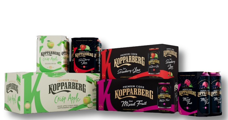
Kopparberg is unveiling the first visual brand refresh in its history, introducing an evolved packaging design across its portfolio that delivers even stronger standout in store – while staying true to the iconic look that made it the UK’s No.1 fruit cider brand*.
 Known for doing things differently, from defining the UK fruit cider category in the early 2000s to building one of the country’s most recognisable brands, Kopparberg’s latest move marks another bold milestone.
The refreshed packaging retains the brand’s distinctive black & gold identity, wordmark and flavour cues, while introducing more vibrant colour and enhanced contrast to deliver even stronger block impact on shelf and clearer, more immediate flavour signposting, helping shoppers find their favourites faster.
At the centre of the redesign is Kopparberg’s unmistakable ‘K’ brand asset, now featured boldly across every pack. The amplified ‘K’ brings a sharper, more contemporary feel to the portfolio, creating a unified look that modernises the brand without losing the familiarity shoppers know and trust.
Rosie Fryer, Senior Brand & Marketing Manager at Kopparberg UK, said:
“Kopparberg has always been pioneering, category defining and original, and this refresh is about taking one of the UK’s most distinctive drinks brands into its next era. We’ve carefully evolved our visual identity to amplify the assets that make Kopparberg iconic, most notably our ‘K’, while creating a bolder, more contemporary packaging system with greater vibrancy, clarity and standout. It’s a redesign rooted in using brand heritage to push forward, designed to strengthen shelf impact and set a new standard for us moving forward.”
Rolling out across all multipacks in both fruit and Crisp Apple variants, the refresh reinforces Kopparberg’s premium positioning and commitment to innovation – ensuring the brand remains as distinctive in store as it is in consumers’ hands.
The new packaging will be on shelves from April 2026.
Comments are closed.