


- Pukka unveils its biggest brand redesign ever, rolling out a bold new visual identity across its entire chilled pie range
- The powerful new packs combine recipe-specific colours to match their well-known rainbow of foils, with a supersized Pukka logo, standout pie photography and clear recipe naming
- Developed following extensive consumer testing, the new design was liked by more than 4 in 5 shoppers[1] and will make Pukka’s range easier than ever to shop
- The redesign reflects Pukka’s proud brand leading role in the category, completing one powerful and cohesive new look across its entire portfolio
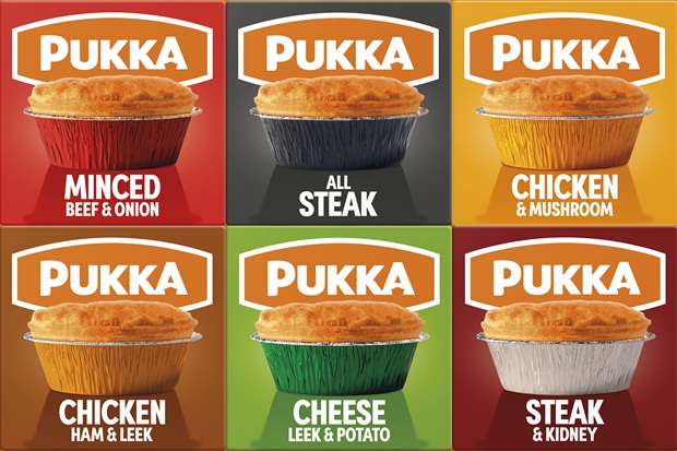 Pukka, the nation’s number one pie brand[2], is set to transform the pie aisle once again as it unveils its biggest brand redesign yet across its entire chilled pie range.
The complete visual overhaul replaces Pukka’s orange packs with powerful recipe-specific colours, creating an unmistakable distinctive new look, designed to stand out at fixture. It also makes favourites easier to find and brings clearer navigation to the category. Pukka’s iconic logo continues to shine through as an orange beacon to the pie aisle, but now the new packs make it easy for shoppers to pick their favourite recipe, with Pukka’s rainbow of foils now also taking centre stage.
Six years ago, Pukka’s move to fully orange boxes revolutionised the pie aisle – marking its transition to more sustainable packaging, with the removal of its plastic windows – helping propel the brand through a period of significant growth. Since then, Pukka’s retail sales have grown from £62m[3] to £82.5m[4] – an increase of 33% – as the brand has expanded its audience and grown distribution. Now, Pukka is using its scale and leadership position to drive the category forward once again.
The redesign puts Pukka’s most powerful brand and product cues front and centre. Every pack is built around three bold elements – a supersized Pukka logo, a generous and appetite-driving image of Pukka’s iconic pie, and distinctive recipe-specific coloured boxes that shoppers will already know and love from Pukka’s unmistakable rainbow of coloured foils. Together, these create maximum impact and excitement at fixture, making Pukka instantly recognisable as the brand revolutionising the category.
Pukka’s iconic orange logo creates a strong, instantly familiar brand block, while its distinctive coloured foils now extend across the entire pack, giving every recipe its own identity. Shoppers can immediately distinguish All Steak in black, Minced Beef & Onion in red and Cheese, Leek & Potato in green, while still recognising each as unmistakably Pukka.
As always, Pukka wanted to ensure the new packaging received a positive response from the nation. Following extensive consumer research and testing, the final design was liked by a massive 85% of respondents[5].
Isaac Fisher, CEO at Pukka, says: “This is a landmark moment for Pukka. Six years ago, we transformed the pie aisle with our orange packaging and built one of the most distinctive brand blocks in the category. Now, we’re ready to drive it forward again with a completely new design that brings even more confidence, colour and impact to the fixture, proudly reflecting our status as one of the category’s most recognisable brands.
“People know exactly what to expect from Pukka – iconic, great quality pies packed with full-on flavour. Our new design captures that confidence with a giant Pukka logo front and centre, a big, delicious-looking pie, and bold coloured packs inspired by our rainbow of foils, providing distinction between recipes. Nothing gets lost. Nothing competes for attention.
“Pukka orange optimism continues to shine through. Our iconic logo is now bigger and bolder than ever, creating a powerful Pukka block across the fixture. Shoppers love being able to spot their Pukka favourites through the coloured foils, so we’ve put these recipe colours at the heart of the design so they can find their favourites at a glance – much like they would navigate the crisp aisle.”
The redesign now also sees black text against a white background on the back of packs, improving readability and making it easier for shoppers to easily navigate ingredients and nutritional information, while clearer cooking instructions create a more seamless journey from pie aisle to plate.
Each recipe will also carry its own QR code, another pioneering feature from Pukka, that will give shoppers easy access to additional product information and help prepare the range for the future evolution of on-pack barcodes.
The new identity will extend far beyond packaging, rippling through Pukka’s wider brand plans and creating a bold, cohesive look wherever shoppers experience it. Major activation plans will support the launch and drive further excitement around the brand, with more details set to be revealed soon.
Fisher concludes: “This is the start of a big new chapter for Pukka. The packs will make an immediate impact, but they’re only the beginning. We have ambitious plans to bring the new identity to life, create more reasons for shoppers to choose Pukka and drive even more energy, colour and full-on flavour to the category, like only Pukka can.”
Pukka’s new-look chilled pie range will begin rolling into supermarkets towards the end of August, available in 205g packs at an RRP of £2.25. The full range will also be available across wholesale and convenience.
[1] Vypr research
[2] NIQ Chilled Savoury Pastry 52 wk to 4th July 2026
[3] Kantar World Panel 52wk value to July 2020
[4] NIQ Chilled Savoury Pastry 52 wk to 4th July 2026
[5] Vypr Sentiment analysis 2026 244/250 respondents
Comments are closed.