

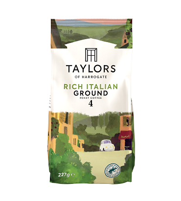
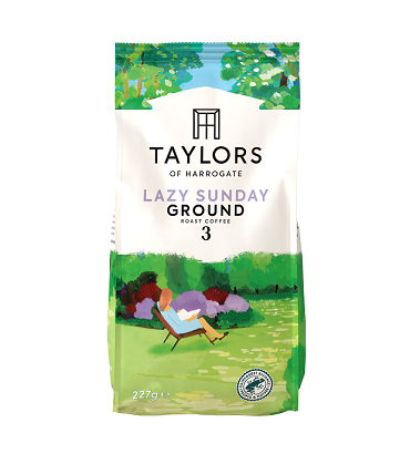
Taylors of Harrogate has redesigned the packaging on its core range which includes its well-known Rich Italian and Lazy Sunday blends
 Taylors of Harrogate has been on a mission to make its coffee packaging more relevant for today’s consumers. After extensive customer research, the top priority for the brand was to ensure easy navigation and recognition on shelf by expressing the brand’s heritage, clearly differentiating ground and beans and simplifying messaging on pack. The new design is available now for independent retailers through all major wholesalers.
First on the agenda was to build on and evolve the Taylors logo to make it more distinctive and unique. The introduction of the roof profile is a nod to the beginning of the Taylors brand which started in a Georgian town house where coffee was passed through a window to awaiting lorries. This expresses the brand’s heritage in a progressive and unique way whilst also creating a distinctive presence on shelf.
To enable easy navigation, ground and beans packs now have a subtle but noticeable colour variation to differentiate the packs on shelf.
Taylors knew that the back of pack guides had a big part to play in simplifying the world of roast and ground coffee. To do this, measurements (which are now in ‘spoons’ rather than grams), language, copy and icons were simplified to form easy-to-follow step-by-step guides.
Whilst much of the packaging has been updated, the illustrations which have become synonymous with the brand’s most popular, well-loved blends like Lazy Sunday and Hot Lava Java have remained on pack. Kelly Wright, Taylors of Harrogate Senior Brand Manager, says, ‘These illustrations are a nod to the brand’s creative flare and history, both of which we’ll always be proud.’
For more information about Taylors of Harrogate, visit https://www.taylorsofharrogate.co.uk/
Comments are closed.